Difference between revisions of "KHIKA Dashboards"
(→Introduction) |
|||
| (5 intermediate revisions by the same user not shown) | |||
| Line 1: | Line 1: | ||
== Introduction == | == Introduction == | ||
| − | A dashboard displays a collection of visualizations and saved searches. You can arrange, resize, and edit the dashboard content and then save the dashboard so you can share it and use it. This means you can create different visualisations, say, one for Active Directory, one for Firewall, one for Anti Virus etc and club together everything in one single dashboard so that you get consolidated view of all your critical data in one single pane of glass. | + | A dashboard displays a collection of visualizations and saved searches. Go to "Dashboards" menu from the left main menu panel in KHIKA and the list of standard dashboards with each KHIKA App installed, comes up here. Click on any one dashboard name to open and check out the report. |
| + | |||
| + | You can arrange, resize, and edit the dashboard content and then save the dashboard so you can share it and use it. This means you can create different visualisations, say, one for Active Directory, one for Firewall, one for Anti Virus etc and club together everything in one single dashboard so that you get consolidated view of all your critical data in one single pane of glass. | ||
A collection of relevant visualizations are pinned to a dashboard. This serves as one live monitoring report that can be refreshed at a desired frequency. | A collection of relevant visualizations are pinned to a dashboard. This serves as one live monitoring report that can be refreshed at a desired frequency. | ||
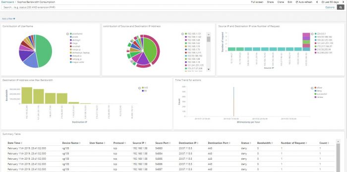
Below is a sample dashboard: | Below is a sample dashboard: | ||
| Line 8: | Line 10: | ||
[[File:Dash1.jpg|700px]] | [[File:Dash1.jpg|700px]] | ||
| + | </br> | ||
| + | [https://youtu.be/hfySFLxlQAA See Video] | ||
== Creating a Dashboard == | == Creating a Dashboard == | ||
| Line 55: | Line 59: | ||
| − | '''To move a box of visualization''' - click and hold the header of a panel and drag drop to the new location. | + | '''To move a box of visualization''' - click and hold the header of a panel and drag drop to the new location.<br/> |
'''To resize a box of visualization''' - click the resize control on the lower right and drag to the new dimensions. | '''To resize a box of visualization''' - click the resize control on the lower right and drag to the new dimensions. | ||
Additional commands for managing each visualization and its contents are in the gear menu in the upper right. | Additional commands for managing each visualization and its contents are in the gear menu in the upper right. | ||
| Line 64: | Line 68: | ||
You can see the precise raw data behind the visualization using the export link at the bottom of the visualisation. There are options for exporting the data in “Raw” or “Formatted” ie. Calculated form as is on the dashboard. | You can see the precise raw data behind the visualization using the export link at the bottom of the visualisation. There are options for exporting the data in “Raw” or “Formatted” ie. Calculated form as is on the dashboard. | ||
Open the dashboard. | Open the dashboard. | ||
| − | Hover over the visualization and click the Expand button in the | + | Hover over the visualization and click the Expand button in the upper right. |
To export the visualization data as a comma separated values (CSV) file, click Raw or Formatted at the bottom of the data table. Raw exports the response data as provided. Formatted exports the response data using applicable field formatters. | To export the visualization data as a comma separated values (CSV) file, click Raw or Formatted at the bottom of the data table. Raw exports the response data as provided. Formatted exports the response data using applicable field formatters. | ||
| Line 71: | Line 75: | ||
| − | To return to the visualization, click the | + | To return to the visualization, click the Shrink button (the same as Expand button) in the top right corner. |
Latest revision as of 10:43, 9 December 2020
Contents
Introduction
A dashboard displays a collection of visualizations and saved searches. Go to "Dashboards" menu from the left main menu panel in KHIKA and the list of standard dashboards with each KHIKA App installed, comes up here. Click on any one dashboard name to open and check out the report.
You can arrange, resize, and edit the dashboard content and then save the dashboard so you can share it and use it. This means you can create different visualisations, say, one for Active Directory, one for Firewall, one for Anti Virus etc and club together everything in one single dashboard so that you get consolidated view of all your critical data in one single pane of glass. A collection of relevant visualizations are pinned to a dashboard. This serves as one live monitoring report that can be refreshed at a desired frequency. Below is a sample dashboard:
Creating a Dashboard
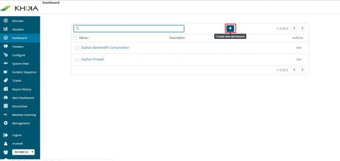
From the left pane of our application screen, click on “Dashboard”. A list of existing Dashboards is displayed on the right. There is an option to create a new Dashboard “+”
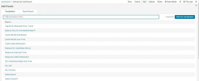
Click on “Add”
This displays a list of Visualizations which were already created in previous section. From this list, you can click on any one or more visualizations, and they get added to this Dashboard.
Add new visualization to create one. If you have a large number of visualizations, you can search the list.
To add a saved search, click the Saved Search tab, and then select a name from the list.(Available in Advanced version)
When you’re finished adding and arranging the dashboard content, go to the menu bar, click Save, and enter a name. Optionally, you can store the time period specified in the time filter by selecting Store time with dashboard.
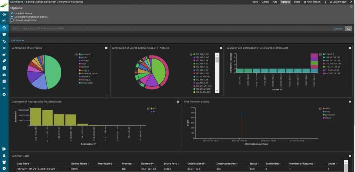
By default, our dashboards use a light color theme. To use a dark color theme,click Edit option and then click Options and select Use dark theme. To set the dark theme as the default, go to Management > Advanced Settings and set dashboard:defaultDarkTheme to On.
Editing Elements on a Dashboard
The visualizations and searches in a dashboard are stored in panels that you can move, resize, and delete. To start editing, open the dashboard and click on “Edit” from various options on the top right.
To move a box of visualization - click and hold the header of a panel and drag drop to the new location.
To resize a box of visualization - click the resize control on the lower right and drag to the new dimensions.
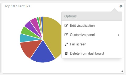
Additional commands for managing each visualization and its contents are in the gear menu in the upper right.
Viewing Visualization data on Dashboard
You can see the precise raw data behind the visualization using the export link at the bottom of the visualisation. There are options for exporting the data in “Raw” or “Formatted” ie. Calculated form as is on the dashboard. Open the dashboard. Hover over the visualization and click the Expand button in the upper right. To export the visualization data as a comma separated values (CSV) file, click Raw or Formatted at the bottom of the data table. Raw exports the response data as provided. Formatted exports the response data using applicable field formatters.
To return to the visualization, click the Shrink button (the same as Expand button) in the top right corner.
Searching / Filtering data on the dashboard
In the above sections we saw how we can explore our inbuilt Dashboards. If we have added multiple APV devices in KHIKA, then we see data for all of them – on each dashboard. To see data on the dashboard for only one device, you have to select the required APV on your Dashboard. There are couple of ways to select a device on your dashboard :
- Add a filter
- Enter Search query
The following procedure is applicable to all Dashboards.
Steps for Adding a Filter on a Dashboard
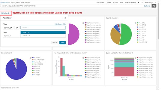
On each dashboard, there is an option, “Add a filter”. Click on the “+” sign to add a new one. Use the simple drop downs in combination, to create your logical filter query.
The first dropdown is the list of fields from our data. We have selected “server_ip” here. The second dropdown is a logical connector. We have selected “is” in this dropdown. The third dropdown has the values of this field. We have selected one device say 10.13.1.3 here. So now, our filter query is : “server_ip is 10.13.1.3”
Click on Save at the bottom of this filter pop up.
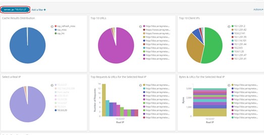
Your Dashboard now shows data for only the selected IP address in all the pie charts, bar graphs and summary table – everywhere in the dashboard.
The applied filter is seen on top.
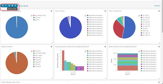
To remove the filter, hover on the filter icon on top (selected in red in above figure). Icons appear. Click on the bin icon to remove the filter. The Dashboard returns to its previous state.
Please Note : If this is just a single search event, donot follow further steps. If you want to save this search for this particular device with the Dashboard, follow steps given further to save the search.
Click on Edit link on the top right of the Dashboard – Save link appears. Click on Save to save this search query with the dashboard.
The filter currently applied shall continue to be seen on top of your Dashboard. You can remove this filter at any point of time in the future by clicking on the bin icon on your dashboard – as already explained.
Steps to Search and Save on a Dashboard
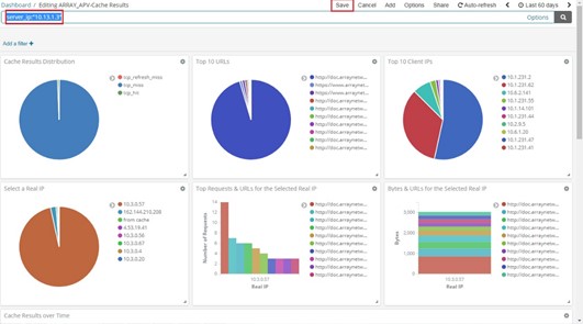
On the top of the Dashboard, there is a text box for search. Enter your search query for a particular device, for example.
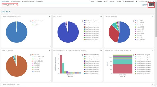
We have entered server_ip:”10.13.1.3” . This is the syntax for server_ip equals to 10.13.1.3. Click on the rightmost search button in that textbox to search for this particular APV on the dashboard.
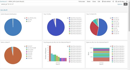
All the elements on the Dashboard shall now reflect data for the selected device.
Please Note : If this is just a single search event, do not follow further steps. If you want to save this search for this particular IP address with the Dashboard, follow steps given further to save the search.
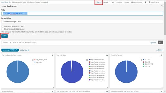
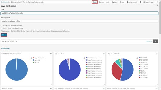
Click on Edit link above the search textbox – Save link appears. Click on Save to save this search query with the dashboard.
This shall stay with the Dashboard and will be seen every time we open the Dashboard.
To remove the search, select the search query which you can see in that textbox, remove / delete it. Click on Edit and Save the Dashboard again. It changes back to its previous state.
Go to the next section for KHIKA Reports
