Difference between revisions of "KHIKA Visualizations"
(→Specify a search query to retrieve the data for your visualization:) |
(→Specify a search query to retrieve the data for your visualization:) |
||
| Line 110: | Line 110: | ||
You can further break down the data by specifying sub aggregations. The first aggregation determines the data set for any subsequent aggregations. Sub aggregations are applied in order— you can drag the aggregations to change the order in which they’re applied. | You can further break down the data by specifying sub aggregations. The first aggregation determines the data set for any subsequent aggregations. Sub aggregations are applied in order— you can drag the aggregations to change the order in which they’re applied. | ||
| − | + | For example, you could add a '''Terms sub aggregation on the URL field'''. This will now be within the real IP of the original bar chart. We can see the URLs those requests were targeting. | |
Revision as of 09:00, 18 June 2019
Contents
- 1 What is a KHIKA Visualization?
- 2 Creating a Visualization
- 3 Examples of Visualization
What is a KHIKA Visualization?
This is the feature that enables you to see your data in a user friendly, analytical fashion. Various options eg. Pie chart, Bar graph, Metrics, Heat maps, Line graphs etc are available to represent your data.
Visualizations, just like their name suggests are aimed at providing pictorial representation of your data. They enable quick insight into data trends, anomalies and hence behaviour of network components and traffic. It is a self-help feature. In the Visualize menu, as shall be explained later in detail, you can create a new one easily by selecting the pictorial options and placing your data / fields on it. Your data fields are brought up here for selection by ‘KHIKA’. You can create your own visualization like bar-graph, pie-charts etc, save it for later use into a dashboard or just for independent view.
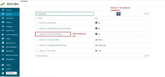
When you Click “Visualize” on left panel, you land-up on the visualization page. It shows up the entire list of existing visualizations.
- You can click on any one from the list to see it independently.
- You can further edit this selected visualization.
- You can also build your own visualizations from here by clicking the “+” button.
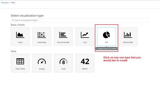
The next screen has options of different types of visualizations to select from.
Say, if you click on Pie Chart, it shall open up the settings page to create a new pie chart. We shall see settings for each type of visualization, in more detail.
You can view the pre-built visualisations shipped with KHIKA.
Creating a Visualization
The options to create new visualizations are discussed below.
Basic Charts
| Line, Area and Bar charts | Compare different series in X/Y charts. |
| Heat maps | Shade cells within a matrix. |
| Pie chart | Display each source’s contribution to a total. |
Data
| Data table | Display the raw data of a composed aggregation. |
| Metric | Display a single number. |
| Goal and Gauge | Display a gauge. |
There are two ways to feed the data to your visualization. You can either select an index and provide a query or you may select a saved search.
Specify a search query to retrieve the data for your visualization:
- To enter new search criteria, select the index pattern for the indices that contain the data you want to visualize. As explained before, the name of the index pattern for the raw logs is like this (say raw logs of linux workspace) business-linux_4-raw-linux-* and name of the index of the calculated data (summarized data derived from raw logs) is - business-linux_4-raw-linux_rpt-* . Refer to the section on selecting index patterns. This opens the visualization builder with a wildcard query that matches all of the documents in the selected indices.
- To build a visualization from a saved search, click the name of the saved search you want to use. This opens the visualization builder and loads the selected query.
Please Note : When you build a visualization from a saved search, any subsequent modifications to the saved search are automatically reflected in the visualization. To disable automatic updates, you can disconnect a visualization from the saved search.
In the visualization builder, choose a suitable metric aggregation for the Y axis. This decides how the data is counted.
Metric Aggregations:
- count
- average
- sum
- min
- max
- standard deviation
- unique count
- median (50th percentile)
- percentiles
- percentile ranks
- top hit
Parent Pipeline Aggregations:
- derivative
- cumulative sum
- moving average
- serial diff
Sibling Pipeline Aggregations:
- average bucket
- sum bucket
- min bucket
- max bucket
For X axis, select a bucket aggregation. This decides how the data is grouped and aggregated
- Date histogram
- Range
- Terms
- Filters
- Significant terms
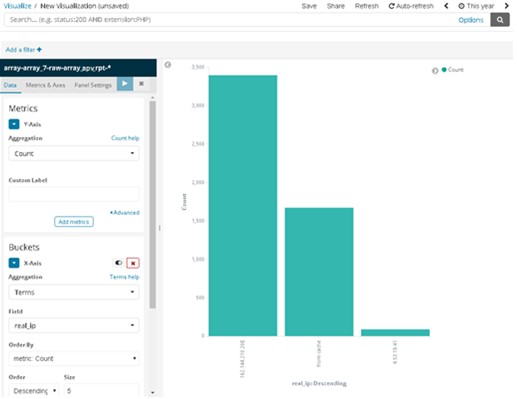
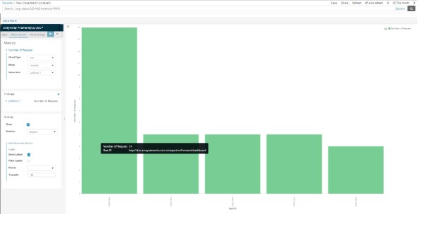
For example, You could create a bar chart showing distribution of requests to real IP by specifying a Terms aggregation on “real_ip” field:
The y-axis shows the number of requests to each real IP, and the real IPs are displayed across the x-axis.
Bar, line, or area chart visualizations use metrics for the y-axis and buckets for the x-axis. Buckets are analogous to SQL GROUP BY statements. Pie charts, use the metric for the slice size and the bucket for the number of slices.
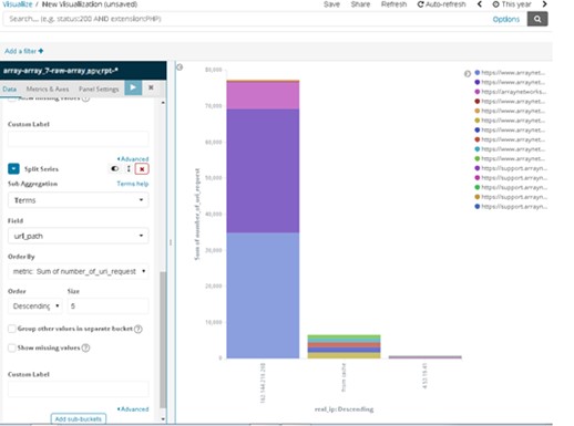
You can further break down the data by specifying sub aggregations. The first aggregation determines the data set for any subsequent aggregations. Sub aggregations are applied in order— you can drag the aggregations to change the order in which they’re applied.
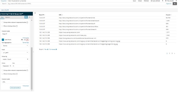
For example, you could add a Terms sub aggregation on the URL field. This will now be within the real IP of the original bar chart. We can see the URLs those requests were targeting.
Saving a filter on the Visualisation
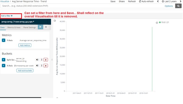
Apart from the Search box at the top and the settings panel on the left, there is another option to add a filter by query. Click on “Add a Filter” A pop up opens. There are dropdowns to select fields, logic like AND / OR and create a filter query. When visualisation is saved, this gets saved with it and reflects on the visualisation till it is removed.
Line, Area, Bar charts, Pie charts and Data Table
Line, Area, and Bar charts allow you to plot your data on X/Y axis. First, you should select your metrics which define Value axis.
Metric Aggregations:
Count
The count aggregation returns a raw count of the elements in the selected index pattern.
Average
This aggregation returns the average of a numeric field. Select a field from the drop-down.
Sum
The sum aggregation returns the total sum of a numeric field. Select a field from the drop-down.
Min
The min aggregation returns the minimum value of a numeric field. Select a field from the drop-down.
Max
The max aggregation returns the maximum value of a numeric field. Select a field from the drop-down.
Unique Count
The cardinality aggregation returns the number of unique values in a field. Select a field from the drop-down.
Standard Deviation
The extended stats aggregation returns the standard deviation of data in a numeric field. Select a field from the drop-down.
Top Hit
The top hits aggregation returns one or more of the top values from a specific field in your documents. Select a field from the drop-down, how you want to sort the documents and choose the top fields, and how many values should be returned.
Percentiles
The percentile aggregation divides the values in a numeric field into percentile bands that you specify. Select a field from the drop-down, then specify one or more ranges in the Percentiles fields. Click the X to remove a percentile field. Click + Add to add a percentile field.
Percentile Rank
The percentile ranks aggregation returns the percentile rankings for the values in the numeric field you specify. Select a numeric field from the drop-down, then specify one or more percentile rank values in the Values fields. Click the X to remove a values field. Click +Add to add a values field.
Parent Pipeline Aggregations:
For each of the parent pipeline aggregations you have to define the metric for which the aggregation is calculated. That could be one of your existing metrics or a new one. You can also nest this aggregations (for example to produce 3rd derivative)
Derivative
The derivative aggregation calculates the derivative of specific metrics.
Cumulative Sum
The cumulative sum aggregation calculates the cumulative sum of a specified metric in a parent histogram
Moving Average
The moving average aggregation will slide a window across the data and emit the average value of that window
Serial Diff
The serial differencing is a technique where values in a time series are subtracted from itself at different time lags or period
Sibling Pipeline Aggregations:
Just like with parent pipeline aggregations you need to provide a metric for which to calculate the sibling aggregation. On top of that you also need to provide a bucket aggregation which will define the buckets on which the sibling aggregation will run.
Average Bucket
The avg bucket calculates the (mean) average value of a specified metric in a sibling aggregation
Sum Bucket
The sum bucket calculates the sum of values of a specified metric in a sibling aggregation
Min Bucket
The min bucket calculates the minimum value of a specified metric in a sibling aggregation
Max Bucket
The max bucket calculates the maximum value of a specified metric in a sibling aggregation
You can add an aggregation by clicking the + Add Metrics button. Enter a string in the Custom Label field to change the display label.
The buckets aggregations determine what information is being retrieved from your data set.
Before you choose a buckets aggregation, specify if you are splitting slices within a single chart or splitting into multiple charts. A multiple chart split must run before any other aggregations. When you split a chart, you can change if the splits are displayed in a row or a column by clicking the Rows | Columns selector.
The X axis of this chart is the buckets axis. You can define buckets for the X axis, for a split area on the chart, or for split charts.
X axis Aggregations
This chart’s X axis supports the following aggregations
Date Histogram
A date histogram is built from a numeric field and organized by date. You can specify a time frame for the intervals in seconds, minutes, hours, days, weeks, months, or years. You can also specify a custom interval frame by selecting Custom as the interval and specifying a number and a time unit in the text field. Custom interval time units are s for seconds, m for minutes, h for hours, d for days, w for weeks, and y for years. Different units support different levels of precision, down to one second. Intervals are labelled at the start of the interval, using the date-key returned by ElasticSearch. For example, tooltip for a monthly interval will show the first day of the month.
Histogram
A standard histogram is built from a numeric field. Specify an integer interval for this field. Select the Show empty buckets checkbox to include empty intervals in the histogram.
Range
With a range aggregation, you can specify ranges of values for a numeric field. Click Add Range to add a set of range endpoints. Click the red (x) symbol to remove a range.
Date Range
A date range aggregation reports values that are within a range of dates that you specify. You can specify the ranges for the dates using date math expressions. Click Add Range to add a set of range endpoints. Click the red (x) symbol to remove a range.
IPv4 Range
The IPv4 range aggregation enables you to specify ranges of IPv4 addresses. Click Add Range to add a set of range endpoints. Click the red (x) symbol to remove a range.
Terms
A terms aggregation enables you to specify the top or bottom n elements of a given field to display, ordered by count or a custom metric.
Filters
You can specify a set of filters for the data. You can specify a filter as a query string or in JSON format, just as in the Discover search bar. Click Add Filter to add another filter. Click the label button to open the label field, where you can type in a name to display on the visualization.
Significant Terms
Displays the results of the experimental significant terms aggregation.
Once you’ve specified an X axis aggregation, you can define sub-aggregations to refine the visualization. Click + Add Sub Aggregation to define a sub-aggregation, then choose Split Area or Split Chart, then select a sub-aggregation from the list of types.
When multiple aggregations are defined on a chart’s axis, you can use the up or down arrows to the right of the aggregation’s type to change the aggregation’s priority.
Enter a string in the Custom Label field to change the display label.
You can customize the colors of your visualization by clicking the color dot next to each label to display the color picker.
Advanced link
You can click the Advanced link to display more customization options for your metrics or bucket aggregation:
Exclude Pattern
Specify a pattern in this field to exclude from the results.
Include Pattern
Specify a pattern in this field to include in the results.
Metrics & Axes
Select the Metrics & Axes tab to change the way each individual metric is shown on the chart. The data series are styled in the Metrics section, while the axes are styled in the X and Y axis sections.
Metrics
Modify how each metric from the Data panel is visualized on the chart.
Chart type
Choose between Area, Line, and Bar types.
Mode
stack the different metrics, or plot them next to each other
Value Axis
choose the axis you want to plot this data too (the properties of each are configured under Y-axes).
Line mode
should the outline of lines or bars appear smooth, straight, or stepped.
Y-axis
Style all the Y-axes of the chart.
Position
position of the Y-axis (left or right for vertical charts, and top or bottom for horizontal charts).
Scale type
scaling of the values (linear, log, or square root)
Advanced Options
Labels - Show Labels
Allows you to hide axis labels
Labels - Filter Labels
If filter labels is enabled some labels will be hidden in case there is not enough space to display them
Labels - Rotate
You can enter the number in degrees for how much you want to rotate labels
Labels - Truncate
You can enter the size in pixels to which the label is truncated
Scale to Data Bounds
The default Y-axis bounds are zero and the maximum value returned in the data. Check this box to change both upper and lower bounds to match the values returned in the data.
Custom Extents
You can define custom minimum and maximum for each axis
X-Axis
Position
position of the X-Axis (left or right for horizontal charts, and top or bottom for vertical charts).
Advanced Options
Labels - Show Labels
Allows you to hide axis labels
Labels - Filter Labels
If filter labels is enabled some labels will be hidden in case there is not enough spave to display them
Labels - Rotate
You can enter the number in degrees for how much you want to rotate labels
Labels - Truncate
You can enter the size in pixels to which the label is truncated
Panel Settings
This is the third tab next to Metrics&Axes.
Settings
These are options that apply to the entire chart and not just the individual data series.
Common options edit
Legend Position
Move your legend to the left, right, top or bottom
Show Tooltip
Enables or disables the display of tooltip on hovering over chart objects
Current Time Marker
Show a line indicating the current time
Grid options
You can enable grid on the chart. By default grid is displayed on the category axis only.
X-axis
You can disable the display of grid lines on category axis
Y-axis
You can choose on which (if any) of the value axes you want to display grid lines
Examples of Visualization
Each type of visualisation - a pie chart, a bar graph, a heat map etc each is explained here step by step so that you can try creating your own.
Please note : Server load balancer log data is considered as an example here. Data source and hence the fields in your data will differ. It shall depend on which data index you select and want to create visualizations on. Fields and values in your data will appear in your instance and you will have to select from them.
Following examples serve as a guideline to give a fair idea about visualization details.
Area Chart
The Area Chart and Line Chart are very similar, except for the Area Chart painting the area below the line, and so it supports different methods of overlapping and stacking for the different areas. Both kind of charts are often used to display data over time. Go to “Visualize” from the left panel. Click on “+” to create a new one. Select Area Chart from the types.
How to Create this Area Chart?
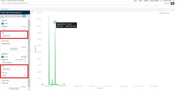
Following settings are suggested in the left panel of the visualization, to get an area chart shown in the diagram.
- In the first Metrics section, on y-axis select Max from the dropdown list of Aggregations (other aggregations like Min, Average, Medium, Sum, etc. are also available) and in Fields, select “elapsed_time” – these names are exactly our field names from our data. We can label it differently on the visualization for the presentation part.
- In the next Buckets section, on x-axis select Date Histogram in Aggregation, in Field select timestamp (real exact field name from data ), in Interval select Hourly interval (you can use different time intervals example Milliseconds, Seconds, Minute, etc.).
In the above example, we calculated maximum value of elapsed time for different timestamps in Hourly interval.
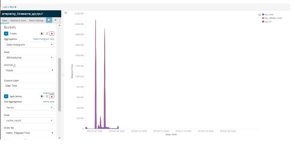
Overlap View
In the overlap view, areas won’t be stacked upon each other.
Every area will begin at the x-axis and will be displayed semi-transparent, so all areas overlap each other. You can easily compare the values of the different buckets against each other that way, but it is harder to get the total value of all buckets in that mode.
To create overlap view,
- Click on Add Sub-Buckets button at the bottom of the Buckets section.Select Split Series.
- Select Terms from list of sub aggregations and cache_result from list of Fields.
You are encouraged to explore further within the settings panel, for creating your customized visualization.
Heat Map
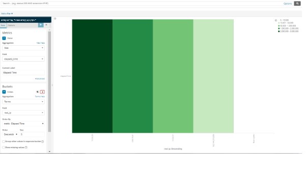
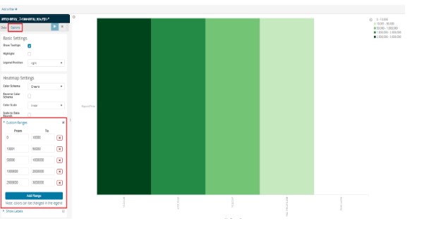
Heat Map charts allow you to plot individual bucket values as a color. Normally, in a chart a color would represent a single metric. In this example, there is a different colour code for each different range of elapsed time.
Go to “Visualize” from the left panel. Click on “+” to create a new one. Select Heat Map from the types.
How to Create a this Heat Map?
Following settings are suggested in the left panel of the visualization, to get a heat map shown in the diagram.
- In the Metrics section : Select Max from list of Aggregations and elapsed_time from list of Fields.
- In the Buckets section : Select Terms from list of Aggregations and real_ip from list of Fields.
Set Custom Ranges for Heat Map
To set custom ranges for heat map:
- Click on Options button, and select Custom Ranges.
- Click on Add Range button to add various ranges.
You are encouraged to explore further within the settings panel, for creating your customized visualization.
Horizontal and Vertical Bar Chart
The horizontal and vertical bar visualization is much like the area visualization, but more suited if the data on your x-axis isn’t consecutive, because each x-axis value will get its own bar(s) and there won’t be any interpolation done between the values of these bars.
Go to “Visualize” from the left panel. Click on “+” to create a new one. Select Horizontal Bar or Vertical Bar from the types.
In this chart, we can see maximum requested URL's.
How to create this Bar Chart ?
Following settings are suggested in the left panel of the visualization, to get a bar chart shown in the diagram.
- In the Metrics section, select Max from list of Aggregations and from Fields, select number_of_uri_request on y-axis.
- In Buckets section, select Terms from list of Aggregations and url_path from list of Fields on x- axis.
You are encouraged to explore further within the settings panel, for creating your customised visualisation.
Stacked Bar Chart
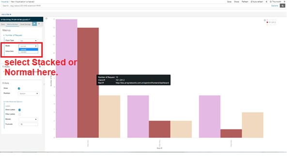
The bars are stacked on one another. In the left settings panel for this visualization, select Metrics and Axes tab on top. Can be done by selecting Mode as “Stacked” in the left panel.
Normal Bar Chart
It will place the bars for each x-axis value beside each other. Click on Metrics and Axes tab and select Normal in Mode.
You are encouraged to explore further within the settings panel, for creating your customized visualization.
Line chart
Line chart is used to display data over time. To get here, go to “Visualize” from the left panel. Click on “+” to create a new one. Select Line Chart from the types.
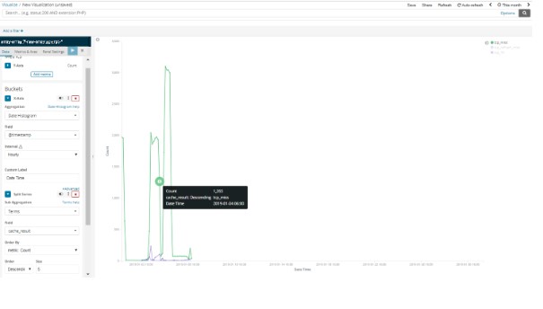
In the below example of line chart, we can see total events of different cache results over a time period (in Hourly manner).
How to Create this Line Chart?
Following settings are suggested in the left panel of the visualization, to get a line graph shown in the diagram.
- Select Date Histogram from the list of Aggregations
- Timestamp from the list of fields for Hourly time interval.
- Click on Add Sub-buckets, then select Split Series.
- Select Terms from list of Aggregations and cache_result from list of Fields.
You are encouraged to explore further within the settings panel, for creating your customized visualization.
Pie Chart
Pie charts are useful to see at a glance the distribution of fields or their ratio. Go to “Visualize” from the left panel. Click on “+” to create a new one. Select Pie Chart from the types.
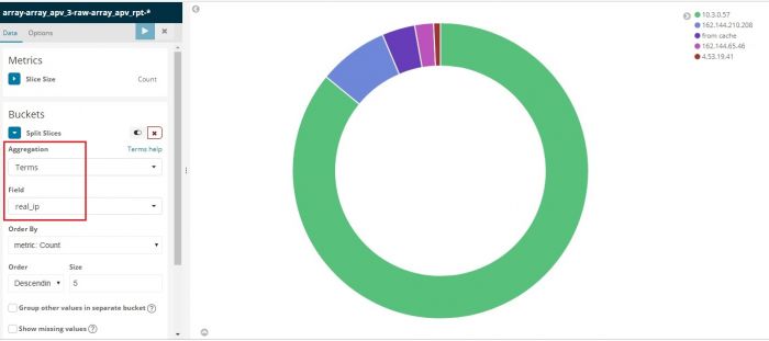
In the above pie, we can see distribution of Real IPs.
How to Create this Pie Chart ?
Following settings are suggested in the left panel of the visualization, to get a pie chart shown in the diagram.
- Select Terms from the list of Aggregations.
- Select real_ip from list of Fields.
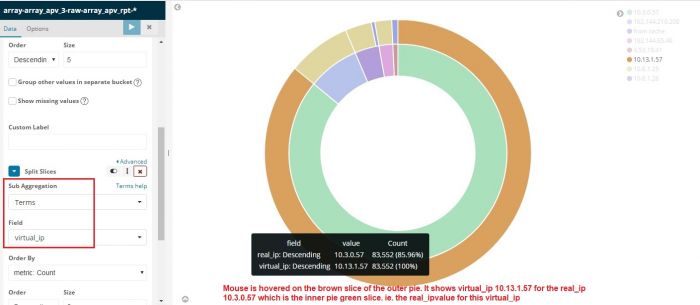
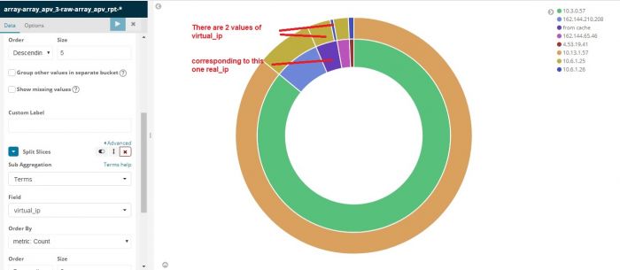
Multi Level Pie Chart
At the bottom of the settings panel, click on "Add Sub Buckets". Same section opens again. Click on Split Settings and follow same procedure as above to create another level / disc in the same pie chart. Lets say, this time we select "virtual_ip" in "Terms" Both levels of pie chart show data corresponding to each other. A new level is created for virtual_ip. By hovering the mouse over any part of the pie, you get a tool tip mentioning what is present on that level of the pie.Here, virtual_ip is on the outer level and real_ip is on the inner level.
You are encouraged to explore further within the settings panel, for creating your customized visualization.
Data Table
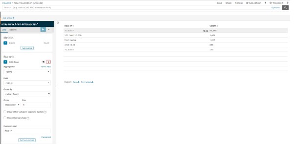
A data table is a tabular output of aggregation results. It’s basically the raw data, presented in a table, that in other visualizations would be rendered into some graphs. Go to “Visualize” from the left panel. Click on “+” to create a new one. Select Data Table from the types.
In the above example, we can see top 5 Real Ips and count of this real ip in a tabular format.
How to Create this Table ?
Following settings are suggested in the left panel of the visualization, to get a data table shown in the diagram :
- Select Terms from list of Aggregations.
- Select real_ip from list of Fields.
After that we can apply a nested aggregation on the real ip field and create more detailed tabular view.
- In the same settings panel, click on Add sub-buckets and select Split Rows.
- Select Terms from list of Aggregations and url_path from list of Fields.
You are encouraged to explore further within the settings panel, for creating your customized visualization.
Gauge
A gauge visualization displays our metrics status relatively within a specified range. Go to “Visualize” from the left panel. Click on “+” to create a new one. Select Gauge from the types.
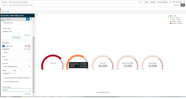
In the above example, we can see max elapsed time required to the real ip.
How to Create this Gauge ?
Following settings are suggested in the left panel of the visualization, to get a gauge shown in the diagram.
- In Metrics section, Select Max from list of Aggregations and elapsed_time from list of Fields.
- In Buckets section, select Terms from list of Aggregations and real_ip from list of Fields.
You are encouraged to explore further within the settings panel, for creating your customized visualization.
Goal
A goal visualization displays how your metric is progressing toward a fixed goal. Go to “Visualize” from the left panel. Click on “+” to create a new one. Select Goal from the types.
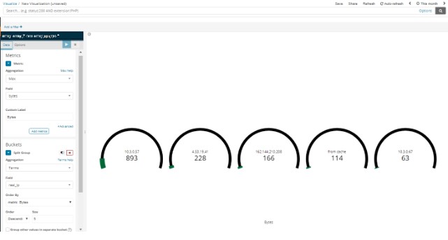
In the above example, we can see max bytes transfered from different real ips.it will changed according to timestamp.
How to Create this Goal ?
Following settings are suggested in the left panel of the visualization, to get a goal shown in the diagram :
- In Metrics section, Select Max from list of Aggregations and bytes from list of Fields.
- In Buckets section, Select Terms from list of Aggregations and real_ip from list of Fields.
You are encouraged to explore further within the settings panel, for creating your customized visualization.
Metric
A metric visualization displays a single number from your data for each aggregation or group or field you select to display. This is useful to see at a glance any critical field and its recent value at the top of the Dashboard say.
Go to “Visualize” from the left panel. Click on “+” to create a new one. Select Metric from the types.
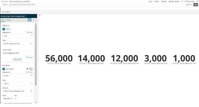
In the above example, we can see maximum server response time required from real_ip to send the data to the client.
How to Create this Metric ?
Following settings are suggested in the left panel of the visualization, to get an area chart shown in the diagram.
- In the Metrics section, select Max from list of Aggregations and server_response_time from list of Fields.
- In Buckets section, select Terms from list of Aggregations and real_ip from list of Fields.
You are encouraged to explore further within the settings panel, for creating your customized visualization.
Refer the next section for KHIKA Dashboards
